Highlight Your Key Logistics Strengths with Big, Clear Icons
Use Big Icons to Make Your Logistics Capabilities Unmistakable
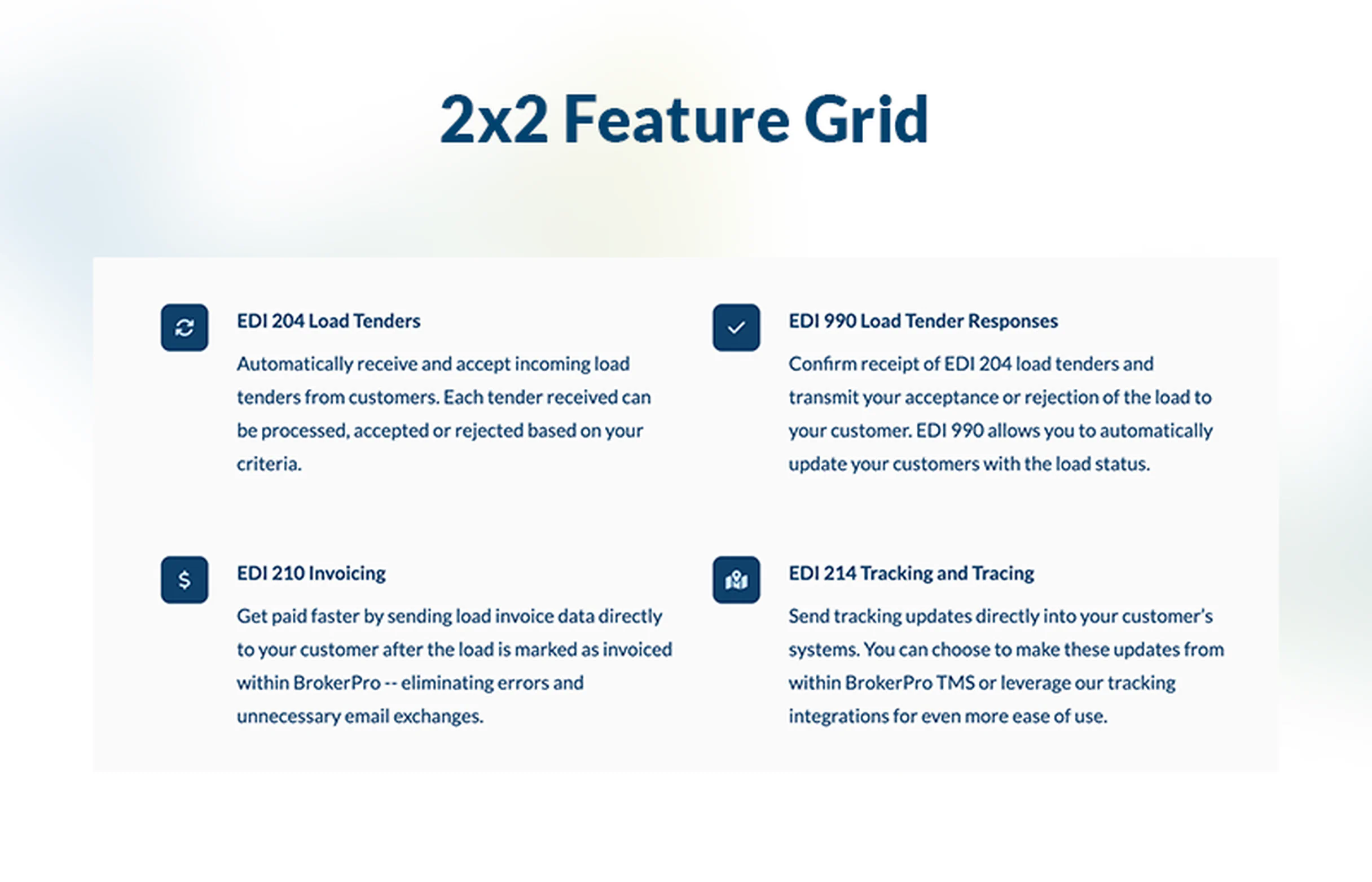
The BrokerOS Feature With Large Icons component uses oversized, visually bold icons paired with short, powerful feature descriptions. This design helps you communicate your core competencies clearly — from real-time tracking to fleet capacity — in a way that’s immediately scannable and memorable.
Larger icons grab attention and help break down your value proposition into distinct, digestible pieces. Prospective shippers can quickly understand what sets you apart — whether it’s your network coverage, technology, reliability, or service flexibility.
- Instant comprehension
- Large icons help users quickly understand key features without needing to read a lot of text.
- Visual distinction
- Bold graphics make each feature stand out, reinforcing your message in a clean, compartmentalized way.
- Scannable layout
- Users can scan four to six features easily — ideal for decision-makers evaluating logistics providers.
- Responsive and flexible
- Our responsive design ensures your icons remain legible across devices, ensuring your features look great on desktop and mobile.
- Credibility through abstraction
- "Icons help distill complex services (like “real-time dispatch” or “custom routing”) into universally understandable visual metaphors."
- Conversion support
- Clear, visually driven features build trust, making visitors more likely to request a quote or reach out to your team.
Ideal for your website
This feature-icon layout is especially effective when:
- You want to showcase your main service pillars (e.g., on-time delivery, full-truckload capacity, tracking, customer support).
- You need a clean section on your homepage or services page that is easy to read and visually striking.
- You’re communicating to B2B customers (shippers, manufacturers, distributors) who care deeply about specific operational strengths.
- You want to reinforce trust and authority quickly via simple, recognizable graphics.
- Your design goal is to be modern, professional, and clear, without overwhelming the reader with too much text.
Best practices for using this logo cloud
Use this Large Icon Feature component to highlight your top strengths, make your service offerings crystal clear, and build credibility at a glance.
- What kind of icons should I use?
-
Use simple, clean SVG-style icons that match your brand tone. Think icons for “truck,” “map / location,” “clock (for speed),” “shield (for reliability),” or “gear (for capacity).” BrokerOS Web uses FontAwesome as a source.
- How many features should I display?
-
4 to 6 features usually work best — enough to cover your main differentiators but not so many that the section becomes busy.
- What text should go with each icon?
-
Use a short title (2–4 words) and a sentence or two of supporting text that explains the feature in terms of benefit or value for customers.
- How do I make sure this looks good on mobile?
-
BrokerOS Web's responsive utilities (like grid-cols-1 sm:grid-cols-2 lg:grid-cols-3) so the icons and features stack or reorganize cleanly at different breakpoints.
- Will large icons help customers trust my business more?
-
Yes — when paired with strong feature messaging, large icons act as visual shorthand that helps reinforce your professionalism and expertise. Clean, well-designed icons boost credibility.
- How should I choose colors for the icons?
-
Use either your brand's primary or secondary colors (or neutral variants) to keep the style cohesive. Make sure there’s enough contrast so the icons are easily visible against the background. Also, be sure to check how they appear in BrokerOS Web's dark mode for your website
