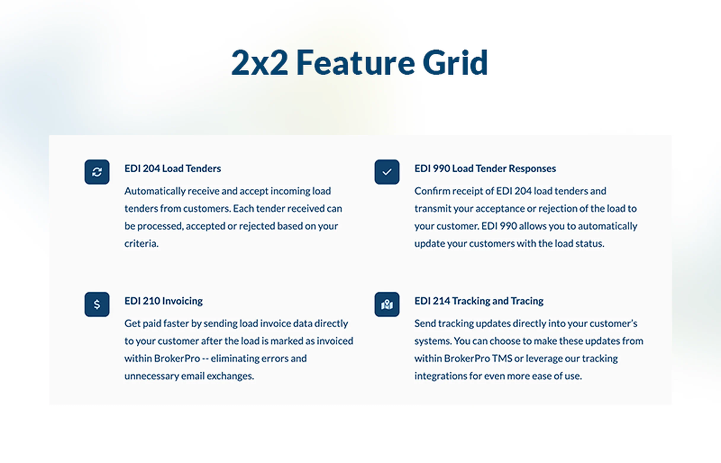
Highlight Key Services with Icons and Linkable Features
Use Icon-Driven Navigation to Guide Prospects to What Matters Most
The BrokerOS Feature With Icon Strip and Links component offers a streamlined, visually-oriented way to present your core logistics services via icons. Each icon represents a major capability — such as freight brokerage, tracking, capacity planning, or customer support — and links to more detailed pages or resources.
By using clear, instantly recognizable icons alongside short labels, you make it easy for visitors to quickly understand and navigate to the key services you offer. This helps potential shippers find exactly what they need — whether it's to get a quote, track a shipment, or learn about your capacity — with minimal friction.
- Visual clarity + speed
- Icons simplify complex service concepts, making it faster for prospective customers to understand what you do. According to logistics-UI best practices, icons help simplify user interaction.
- Universal visual language
- Well-designed logistics icons act as a universal language, improving comprehension across audiences and reducing cognitive load.
- Immediate engagement
- Clickable icons let users jump directly to the service or information they care about most — such as “LTL Freight” or “Real-Time Tracking.”
- Responsive and scalable
- Built with Tailwind CSS, the icon strip adjusts smoothly for different screen sizes, so icons remain legible on mobile or desktop.
- Professional credibility
- Using clean, modern icons to represent your services gives your site a polished, trustworthy feel — reinforcing that you are a serious logistics partner.
- Improved UX
- As digital logistics platforms are increasingly using icon-based navigation, your service site feels modern and user-centered.
Ideal for your website
This icon-strip component is especially valuable when you want to:
- Make your core logistics services clearly accessible from a single section (e.g., Quote, Tracking, Network, Support)
- Direct prospects to detailed pages or tools without overwhelming them with text
- Highlight your breadth of services in a compact, visually clean way
- Provide an intuitive shortcut for high-use actions (like “Get a Quote” or “Track Load”)
- Use on homepage, services page, or a capabilities overview to help users quickly find what they came for
Best practices for using this logo cloud
Use this Icon Strip With Links component to create a clean, navigable service strip that helps prospects find the exact logistics tools or services they need — fast.
- Which icons should I choose?
-
Use simple, recognizable icons for your top services — for example, a truck for “Transport,” a map pin for “Coverage / Hubs,” a chart or graph for “Capacity Planning,” and a speech bubble or headset for “Support.”
- How many service icons should be in the strip?
-
Typically, 4 to 6 icons work best. This provides enough variety to cover your key services without cluttering the strip.
- How should I label each icon?
-
Use short, action-oriented labels: e.g., “Get a Quote,” “Track Shipment,” “Our Network,” “Support / Help.”
- Should each icon link to a different page?
-
Yes — that’s the main benefit of this component. Link each icon to the right internal page or tool (service detail, tracking, contact form) to maximize usability.
- Why use icons instead of text links?
-
Icons speed up comprehension and make your service list more visually engaging. In logistics, where concepts can be complex, icons help explain things clearly and quickly.
- What color should I use for the icons?
-
Choose a color that reinforces your brand and keeps contrast high for readability.
Here are good rules of thumb:- → Use your primary brand color for a clean, unified look.
- → If your brand color is bold or dark, use a lighter neutral background so the icons stand out.
- → If your site uses soft neutrals, a single accent color (blue, green, or indigo) keeps the strip visually cohesive.
- → Maintain consistent icon color across the entire strip — never mix multiple icon colors unless it’s part of your brand identity.
- → Always ensure sufficient contrast for accessibility, especially on white or very light backgrounds.