
A Bold, Color-Driven First Look
Make Your Hero Section Clear and Purposeful
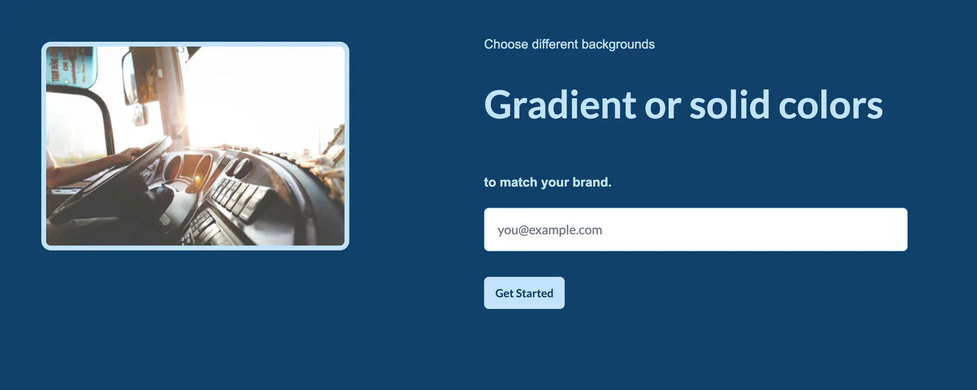
This BrokerOS Web Hero component with a solid color background gives your website a crisp, modern hero section that’s clean, focused, and highly customizable. By swapping in a strong color instead of an image or gradient, you’re emphasizing clarity and brand consistency right from the start. This hero layout isn’t just visually appealing — it’s designed to deliver your core message with maximum impact. The solid color background ensures your heading, sub-text, and call-to-action stand out without distraction, helping guide visitors to take action.
- Strong brand identity
- A solid color background lets you lean into your brand palette, reinforcing brand recognition and cohesion.
- High contrast, clear messaging
- With ample contrast between text and background, your headline and subtext are easy to read — even on smaller screens.
- Focused conversion path
- The embedded form coupled with other CTAs makes it easy for visitors to take the desired next step.
- Fully responsive layout
- This hero scales smoothly across all devices — mobile, tablet, and desktop — while keeping typography sharp and layouts consistent.
- Customizable design
- You can adjust the background color, overlay opacity, text alignment, and CTA styling to align with your brand voice and style.
- SEO and accessibility-friendly
- Using semantic HTML with clear headings, plus proper alt text or ARIA labels where needed, this hero supports both search performance and inclusivity.
Ideal for your website
This hero variant is especially well-suited when you want to:
- Make a clean, professional first impression with no visual clutter.
- Highlight a single, clear value proposition or message.
- Use brand color as a design tool, making your hero feel cohesive with the rest of your site.
- Drive visitor action with a focused, contrasting CTA — without competing visuals.
Best practices for using this hero
Want more advice on how an impactful hero can generate more business for you? Reach out to our sales team.
- Which color should I choose for the background?
-
Pick a color from your brand palette that aligns with your identity and stands out. Make sure it’s not too light or dark for your text — contrast is key.
- How do I make my headline legible on a solid color background?
-
Use a bold, high-contrast font (e.g., white or black depending on background) and keep your headline concise. Strong, simple messaging works best here.
- What kind of call-to-action (CTA) works best?
-
Use a clear, action-oriented CTA like “Get Started” or “Request a Demo.” Ensure the button color contrasts well against the background and is visually prominent.
- How much supporting text should I put below the headline?
-
Stick to one or two short sentences that reinforce your headline without cluttering the hero. The simpler the better.
- How do I ensure it looks good on mobile and tablet?
-
Test your design across devices to check contrast and spacing. Use responsive font sizes and padding so your headline, subtext, and CTA remain readable and clickable.
- How do I make this hero SEO-friendly and accessible?
-
BrokerOS Web components handle most of this for you, however, it's important to use proper heading tags (H1 or H2) for your main text, and include ARIA labels or alt text where needed. Proper structure helps both search engines and users with assistive technologies.
Related Heros
-
 Content with Image
 -
 Dramatic Hero with Call to Action
 -
 Hero with Background Image & Gradient Overlay | BrokerOS Web Components
 -
 Hero with Background Image & Stacked Buttons
 -
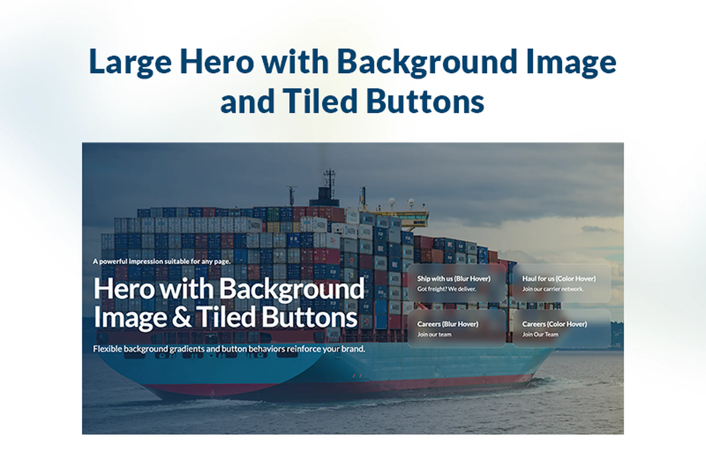 Hero with Background Image & Tiled Buttons
 -
 Hero with Embedded Form - Gradient Background
 -
 Hero with Multiple CTAs - Color Background
 -
 Hero with Multiple CTAs - Gradient Background
 -
 Hero with tiled images
 -
 Large Hero with Background Image
 -
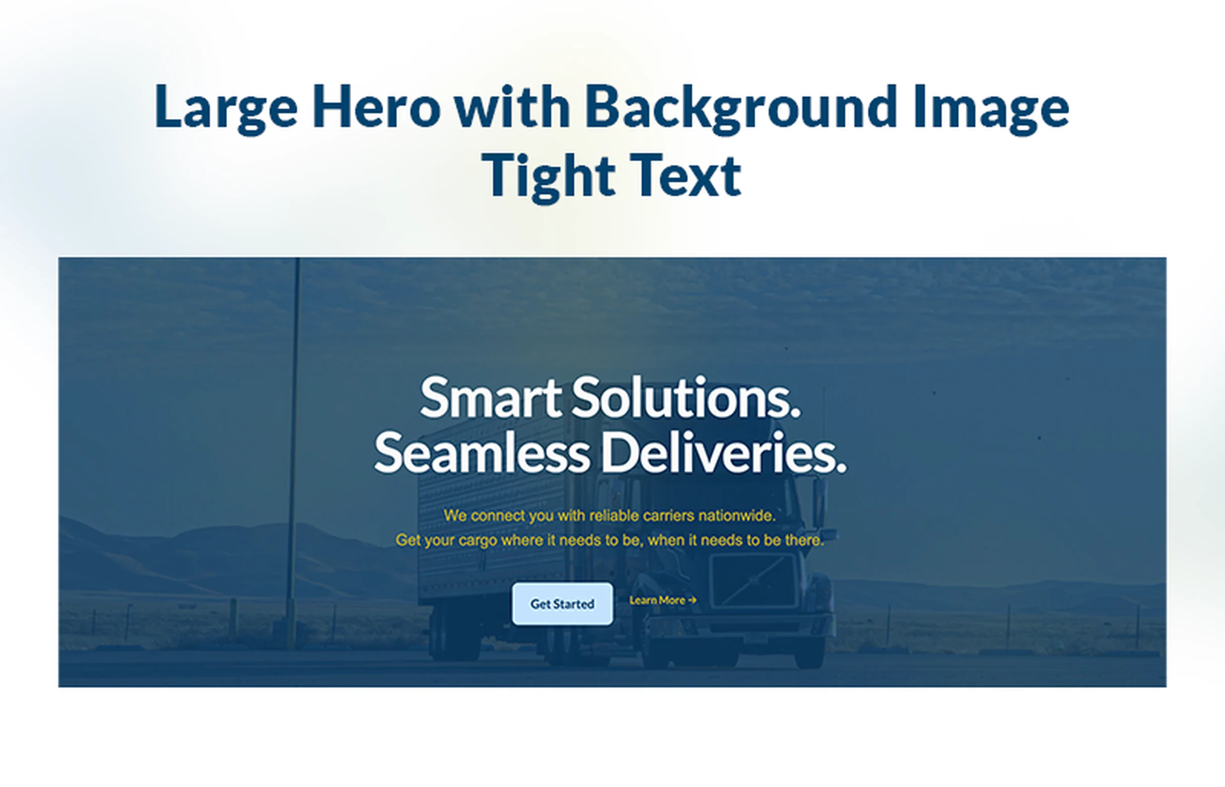 Large Hero with Background Image - Tight Text
 -
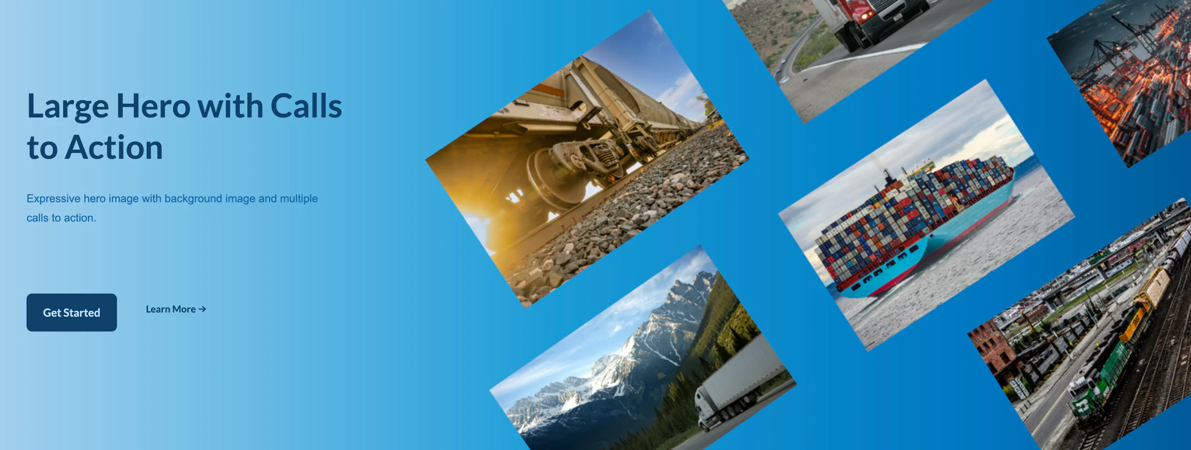 Large Hero with Calls to Action
 -
 Simple Header
 -
 Simple Header with Background Image
 -
 Simple Hero with Gradient Background and CTA